Quick answer: Wedding favors should complement your color palette by either matching key colors directly, using accent shades, or incorporating metallics and neutrals that tie the entire scheme together. Consider your venue’s lighting, the season, and your color palette’s structure (monochromatic, complementary, or analogous) before selecting favors that echo those tones.
A wedding favor is a small token, but it carries outsized meaning. It’s the last thing your guests hold as they leave your celebration, and a tangible reminder of the day you spent months designing. When that favor reflects your wedding’s color palette, it becomes more than a parting gift. It becomes a final, elegant brushstroke on the canvas you’ve been painting since the moment you said “yes.”
Color coordination is the quiet thread that ties a wedding together. From the flowers on the tables to the ribbons on the chairs, every element speaks the same visual language. Favors that echo this language reinforce the mood you’ve worked so hard to create, whether that’s romantic and pastel-hued or bold and jewel-toned. Guests may not consciously register why your wedding felt so polished, but a cohesive palette, carried through to the smallest details, is often the reason.
This guide walks you through understanding your palette, translating it into favor choices, and staying on budget. By the end, you’ll have a clear framework for choosing favors that feel intentional rather than an afterthought.
What Is a Wedding Color Palette, and How Do You Define Yours?
Before you can match favors to your colors, you need a clear picture of what those colors actually are.
What’s the difference between primary and accent colors in a wedding palette?
Most wedding palettes are built around one or two primary colors, which appear most prominently in elements like bridesmaid dresses, linens, and floral arrangements. Secondary accent colors play a supporting role, showing up in smaller details like ribbon trims, candle holders, or place card lettering. When selecting favors, primary colors are usually the safest choice for larger or more visible items, while accent colors work beautifully on smaller, delicate touches like packaging or tags.
How does venue lighting change the way your colors look?
Lighting can transform how a color reads in person. A blush pink that looks soft and romantic under natural daylight might appear washed out under warm reception lighting, while deep jewel tones tend to glow under low, ambient light. If possible, view your favor samples in a setting similar to your venue’s lighting conditions before finalizing your order. This small step prevents the disappointment of unwrapping favors that don’t look quite right on the big day.
Should the season influence your color and favor choices?
Seasonal cues naturally guide color choices. Spring weddings often lean into soft pastels, summer into vibrant brights, autumn into warm rust and amber tones, and winter into deep jewel colors paired with metallics. Favors that nod to the season, like mini candles for a cozy autumn wedding or fresh herb sachets for a spring garden celebration, feel especially harmonious.
Which Favor Styles Work Best for Popular Color Palette Types?
Once you’ve defined your palette, the next step is understanding its structure, since that shapes which favors will feel most cohesive.
How do you choose favors for a monochromatic palette?
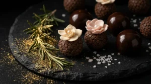
A monochromatic palette relies on varying shades and tones of a single color. Favors work well here when they layer different tints of that hue, such as a deep burgundy ribbon tied around a lighter blush box. This creates visual depth without straying from the scheme. Edible favors like floral brigadeiros are particularly versatile here—their hand-piped sugar florals can be color-matched to specific shades in your palette, making each piece feel like a deliberate design choice rather than a standalone treat.
What’s the best approach for a complementary color scheme?
Complementary palettes pair colors from opposite sides of the color wheel, like navy and blush or emerald and gold. For these palettes, favors don’t need to include both colors in equal measure. Instead, choose one dominant color for the favor itself and use the second as an accent, such as a navy box tied with a blush ribbon.
How do analogous palettes translate into favor choices?
Analogous palettes use colors that sit next to each other on the wheel, like coral, peach, and gold. These palettes tend to feel soft and naturally blended, so favors with a gradient or ombre effect, or simply a mix of items in each shade, tend to feel right at home.
Can neutral palettes with metallic accents still feel special?
Absolutely. Neutral palettes built around ivory, taupe, or dove gray often use metallic accents like gold, silver, or rose gold to add shimmer and dimension. Favors that incorporate these metallics, such as a rose gold-foiled tag or a silver-rimmed candle jar, elevate a neutral scheme without overpowering it.
What Are Some Practical Favor Ideas by Color Category?
Translating a palette into actual products can feel overwhelming, so here are specific ideas organized by color family.
Pastels: Soft palettes call for favors that feel equally delicate. French macarons in blush or lavender, hand-poured candles in pale glass jars, and floral brigadeiros adorned with light-toned sugar florals in shades of white, blush, or sage all sit beautifully within a romantic, pastel-forward tablescape.
Bold colors: Rich, jewel-toned schemes call for favors with equally strong presence, such as artisan chocolates in vibrant wrappers, small succulent plants in colorful pots, or custom-decorated cookies iced in your palette’s shades. Floral brigadeiros work here too — their edible flower toppings can be sourced or crafted in deeper, saturated hues like burgundy, plum, or terracotta to mirror your reception’s color story.
Metallics: For weddings built around gold, silver, or rose gold, consider personalized ornaments, mirror compacts, or delicate jewelry pieces that reflect light and catch the eye. Pair any of these with a small wrapped confection, finished with a foil-stamped tag, to tie the metallic thread through to the favor table.
Neutral tones: Earthy, understated palettes suit natural soap bars, dried flower bundles, or small wooden keepsakes that feel organic and warm.
How Can You Coordinate Favors With Your Colors on a Budget?
A cohesive look doesn’t require a large spend. A few strategic choices can stretch your budget significantly.
Is DIY favor packaging worth the effort?
DIY packaging is one of the most effective ways to save money while maintaining color consistency. A plain, inexpensive favor becomes elevated with a hand-tied ribbon, a custom-stamped tag, or a coordinating wrapper, all of which you can assemble in your exact palette for a fraction of the cost of pre-packaged options.
Where should you look for bulk or wholesale favor options?
Ordering favors in bulk from wholesalers, especially for items like candles, soaps, or small jars, typically reduces the per-unit cost substantially. Many wholesalers also offer these items in a range of base colors, which minimizes the need for additional dyeing or customization.
Can you combine several inexpensive items into one coordinated favor?
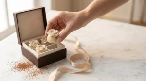
Building a small gift set from a few low-cost items, such as a mini candle, a piece of wrapped candy, and a decorative tag, often feels more thoughtful than a single higher-priced item, while still allowing every component to reflect your palette. For couples who want one signature piece that speaks for itself, a beautifully packaged edible favor like a floral brigadeiro, presented in a box coordinated to your wedding colors, can create that same feeling without multiple components.
Let Every Detail Speak the Same Language
Matching your wedding favors to your color palette isn’t about perfection. It’s about creating visual harmony that guests feel, even if they can’t quite name it. These small details, chosen with intention, are often what people remember most fondly after the celebration ends.
Start exploring your favor options early, especially if you’re hoping to secure specific colors or customized items, since many vendors require lead time for production. Your color palette has already shaped so much of your wedding’s design. Let it guide this final, memorable touch.
Frequently Asked Questions
How far in advance should I order wedding favors? Most couples order favors 2 to 3 months before the wedding, though customized or handmade items may require 4 to 6 months of lead time.
What if my venue’s lighting doesn’t match how I imagined my colors? Test favor samples under lighting similar to your venue before ordering in bulk, and consider adjusting to slightly deeper or lighter shades to compensate for how the lighting affects color perception.
Are edible favors a good choice for color-coordinated weddings? Yes. Edible favors like macarons, chocolates, floral brigadeiros, and custom cookies are easy to customize in color and often feel like a thoughtful, consumable keepsake rather than an item guests need to find a use for. Many artisan confections can be made to order in specific hues, making them a surprisingly flexible option for palette-driven weddings.
How many favor options should I consider before deciding? Reviewing 3 to 5 options within your budget and palette gives enough variety to compare quality, cost, and color accuracy without becoming overwhelming.
Do favors need to match my colors exactly, or can they complement them? Favors don’t need to match exactly. Complementary or accent shades, along with metallics and neutrals, often blend more naturally into a wedding’s overall design.